
With another year in the can it's time to look back towards the best and worst covers of 2020. Purely subjective - with some favorited or disliked for purely personal reasons - this list acts as a fun round-up of the year. Take a look back in time for the best and worst covers of 2020, 2019, 2018, 2017 and 2016. As per usual, one rule of thumb applies: I must have listened to the album, otherwise intent could be lost.
___________________________
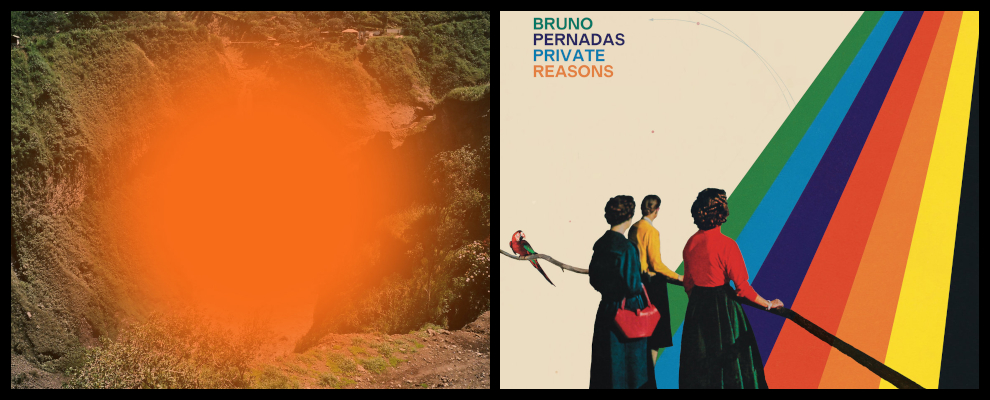
Best | Bruno Pernadas - Private Reasons | Every cover by Bruno Pernadas is exceptional, and Private Reasons is no exception. Their brand of elaborate Progressive Pop uses a myriad of colors, reflected here, quite literally, by an escalating rainbow. Odd dots and lines help fill an otherwise beige background, as classic 50's onlookers - a staple of fashion for retro-futurists enamored with Space Age Pop, as is the case with Pernadas - gazes into the colorful abyss. Throw a nod to Those Who Throw Objects in for good measure, with the parrot off to the side.
___________________________

9
Worst | Black Country, New Road - For The First Time | Ah yes, the classic "we know our music's incredible, so let's purposely make our visuals crap" trope. It's post-ironic, whatever that means. Take the text and context away from For The First Time and you're left with an inconsequential image that wouldn't garner any likes on some kid's Facebook page. There's not even a hint of meaning here. And the eye-rolling inclusion of the artist's credit is the cherry on top. It's almost mocking "asafyrov," considering how phenomenal the album is and how useless the photograph is.Best | Low - HEY WHAT | Minimalism and abstract done right. In art, more often than not, I despise the two. Especially when they don't have the benefit of being attached to a secondary piece of art, like this cover does with Low's music. But here, what ultimately looks like a microscopic image of some desaturated, dusty fabric, takes on a totally new form once the dire, dreadful, morbid sounds of HEY WHAT are heard. You take the starkness of Ambient Pop and the garishness of Post-Industrial, which is effectively what Low did on HEY WHAT, and this is the visual result. Minimalistic and abstract.
___________________________

8
Worst | Tyler, The Creator - Call Me If You Get Lost | Sure, it pays homage to Ol' Dirty Bastard and his cover of Return To The 36 Chambers - fitting given Tyler's reconnection to rugged Hip-Hop - but apart from that, Call Me If You Get Lost's suffers like many "unusual" covers do in that it's not fit for the classic, square cover format. The meaningless white space dominates the scene, and the license itself fails to make any sort of impact outside of the obvious homage.Best | Aaron & Lucy - Lucy & Aaron | This is just flat-out, shape-shifting cool. It's one thing when an artist can correctly correlate their sonic landscapes to a visual medium. It's another entirely, when it's one as peculiar and surreal as Lucy & Aaron. Tape Music left on the stovetop of a kept housewife from the 1950's, boiling and internally-conflicted. The masquerade of expression, startling pink (for an experimental album), three-dimensional depth. All of it works so, so well together.
___________________________

Best | Floating Points & Pharoah Sanders - Promises | Floating Points' Promises garnered plenty of critical acclaim this year. From Jazz circles, I'm sure it's warranted. From an outsider who seeks substance in his music, I don't get it. Nonetheless, the cover is striking. Unlike Tyler, The Creator's album, this excess of white works because the bold text and artistic detail found in the centerpiece draw your eyes away from it, rather than to it. I'm not even sure what's happening on those three planes of existence, but it's a sensational mix of realism and abstract. Subway maps slathered in graffiti.
___________________________

Best | Lingua Ignota - Sinner Get Ready | Lingua Ignota's aesthetic has never wavered. Up close and personal, intimate and brooding. Each cover of hers prominently features her portrait, tormented and pained. Sinner Get Ready is no different, apart from the mystique of an opaque headgear which matches the religious grandiosity and illogical pragmatism that dominates the album. Eery, menacing, and gorgeous.
___________________________

Best | Nala Sinephro - Space 1.8 | It's easily my least favorite album on this side of the list, but there's no discrediting the bold, stark minimalism that gracefully commands the cover of Nala Sinephro's Space 1.8. I mean, look at that font. It's so thin, so peckish, yet Sinephro somehow manages to adorn the entire cover with it. The abstract pink splotch compliments the traipsing human figure and the rainbow rings admirably as well, combining forces to reflect the album's space-faring Jazz perfectly.
___________________________

Best | Armand Hammer - Haram | Armand Hammer won this list last year with their remarkable cover for Shrines. With Haram, they've come close to winning again. Any cover that's censored by Google, in spite of the plethora of absolutely grotesque and vile content one can find in images there, deserves kudos. The name Haram - meaning "forbidden or proscribed by Islamic law - contrasts beautifully with the image of two decapitated pig heads. A sight that offends millions, despite those same millions proliferating such abuse by consuming pig meat in hordes.
___________________________
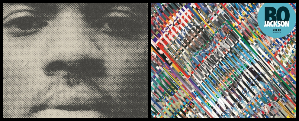
Best | Boldy James & Alchemist - Bo Jackson | This is so freaking cool. Whoever edited this, props to them. Obviously, there's no covert messages or implied double meanings here. This is an album called Bo Jackson with a handful of Bo Jackson trading cards chopped to bits. Trippy, yet really effective and simple. I love how the rich color palate just emerges naturally. Like there's no editing or touch-ups going on. You dice a couple baseball cards into thin strips using a scissor, then lay them on the table against one another, it'll look like this. Though it likely wasn't intentional, the one parallel I can find dates back to the days when kids would put trading cards in the spokes of their bike tires to make them sound like a motorcycle. I can see some of these cards having met the same, destroyed fate.
___________________________

Best | Lost Girls - Menneskekollektivet | Initially, Menneskekollektivet's cover was my number one. But, despite still loving it, I struggled to come up with reasons as to why. Still, I'll do my best. It manages to satisfy two schools of thought that tend to be polar opposites; minimalism and mystery. It's creepy no matter which way you look at it; literally. Either these "Lost Girls" (wink wink) are staring absentmindedly at a concrete wall, or they're actually facing forward, concealed entirely by their hair. I love it. The black and white, shadows, complete lack of text (in spite of the potential with the word Menneskekollektivet), all of it comes together in something so effortless, yet cerebral.
___________________________

Best | shame - Drunk Tank Pink | Initially, shame's Drunk Tank Pink didn't really capture the imagination. But then I learned that drunk tank pink is an actual color, meant to offset the aggression of intoxicated prisoners. It's the color displayed in the font. Now, contrasted against the beautifully-stark black and the shrouded image of a seeming ne'er-do-weller (the drummer's own father) one begins to conjure up images of abuse, machoism, and violence, and how these can be combated. All topics discussed within the album. In terms of checking off the boxes for what makes a great album cover, it doesn't get much better than this. It lacks the instant gratification, but once one looks further down, resonance begins to grow.
___________________________
No comments:
Post a Comment